Yale School of Art Website Redesign
UX Prototyping, Digital Branding, UX Design

Check it Out!
Challenge
As a group, take an absolutely terrible website and redesign it to be usable, beautiful, and on-brand.
Solution
A bold redesign and rebrand that matched the Yale School of Art's unique and creative tone.
Results
Users now have an organized, useful platform to access school information, student pages, and an online art exhibit.
The Old Yale
Before our design process could begin, we had to take a hard look at what we were dealing with. The website can be edited by any student in the Yale School of Art, so naturally, there is no coherent design system at all and it even seems like they intentionally designed the site poorly as a joke or artistic statement.


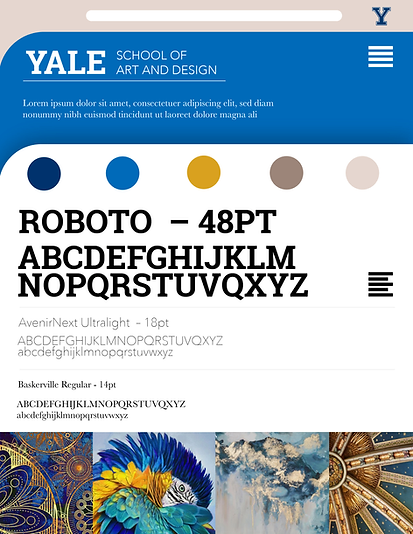
Branding Guides
In order to develop a consistent design language for all elements of the site, we built out a branding guide based off of Yale's traditional academic brand. While it looked nice and fit well with Yale's other websites, it was lacking the rebellious spirit of the School of Art. After going back to the drawing board we came up with a bold new take on Yale's brand that circumvents expectations and becomes a vessel for artistic expression.


Making it Meaningful
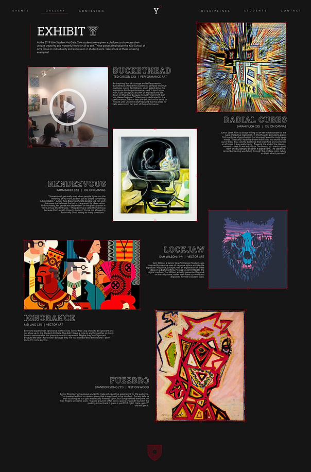
One of the surprising elements that was missing from the original site was a gallery of student work that users could see. Exhibit Y is an online digital gallery that presents and celebrates student work. Some pieces, like 'Buckethead' could only be captured digitally, emphasizing the importance of a digital gallery.
Iconogrophy
When we looked at the original website, we could see that there were four different sub-schools at Yale that didn't really have a way to visually separate themselves from each other, since every page was uniquely terrible and gaudy. Instead, we developed four visual icons that not only represented the sub-school, but also fit into the new brand's aesthetic.

To see the final prototype we put together, take a look at our interactive demo.